Description: This blog talks about the emerging color trends of 2024 that are expected to show throughout the year.
A new year calls for change. This can be personal, physical, or online based. In this case, online trends are emerging for this year and one of those trends has to do with the use of color in websites. Color in websites is more important than most people think, it isn’t just about making something look nice. For my designers, something called color psychology can often play a part in the creation of a website or design. Color psychology gives a meaning to different colors and shows how certain colors can evoke different emotions. For example, blue is often considered to represent calmness. So, it’ll usually be used for sites looking to have that type of energy and feel to it. Or it’s simply someone’s favorite color but let’s stick with the color psychology meaning.

Upcoming Color Trends
Peach
After doing research, I’ve seen the color peach pop up a lot as an upcoming color. Pantone, known for their color determination and printing, declared “Peach Fuzz” as the color of the year for 2024. It’s a warm mix between pink and orange and was labeled by Pantone because it represents our “desire for togetherness”. According to Kimp, Sherwin-Williams has a shade of peach in their Color of The Year collection as well. It’s called “Persimmon” and gives a terracotta earthy vibe. (Thank you, Minecraft, for making me aware of what Terracotta is)
Earthy Color Trends
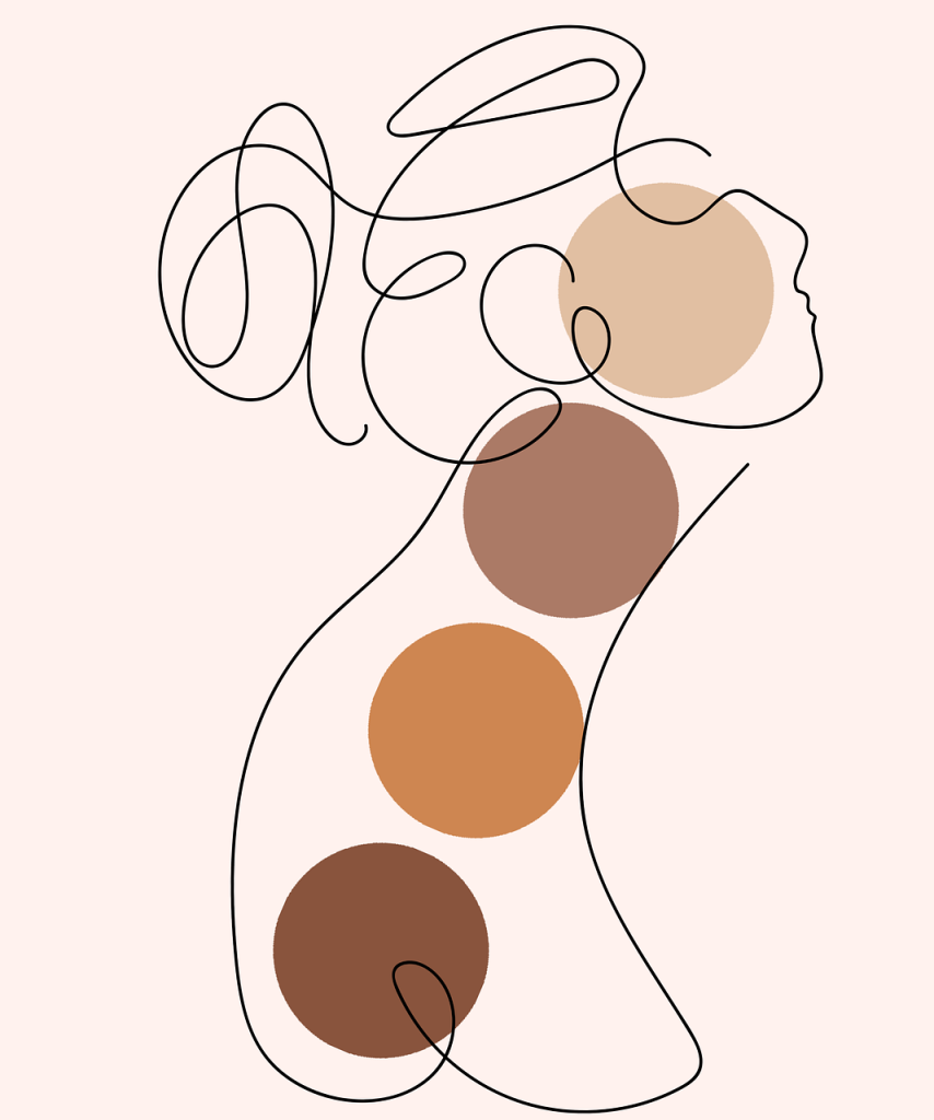
As a side note, combining earthy colors is another color trend for the year!

In social media, the color peach has become a powerful color for campaigns. More specifically, in the self-love and fashion niches since those areas have been becoming more and more popular. The fashion industry is constantly changing, and through platforms such as TikTok, I feel like it’s spread more than ever. Or at least more people have become interested in it, and new styles have been developed. Peach, which Pantone said represented togetherness, is a great color to be used within these niches because those industries focus on connecting and evoking emotions with an audience. The self-love industry wants something people can relate to, and the fashion industry wants to connect with people who have similar styles.
Using blue color trends to clear minds
Since I brought up Sherwin-Williams’s Color of The Year collection, let’s talk about the color they chose for 2024. “Upward” is a shade greyish shade of blue that represents slowing down and clearing our minds. Blue is used throughout many industries because of its calming effect. C2 Paint’s color of the year was a shade of blue called C2 Thermal, Krylon’s color of the year was Bluebird. (Reminds me of Naruto if you know you know), Valspar’s color of the year was “Renew Blue”, and Benjamin Moore’s color of the year was Blue Nova 825. As you can see, blue is a pretty popular color this year. About 5 companies named a shade of blue as their color of the year, so it’s probably worth looking into. Click on the links to see the shades!
How to combine color trends
There are plenty of ways to combine these colors, and Kimp gives great examples. I want to briefly talk about a popular technique that could be applied to these colors though. This is called the 60-30-10 rule, and it can be very beneficial when combining colors in sites. 60-30-10 represents 60%, 30%, and 10%. This rule states that 60% of a site should be the most dominant color, 30% should be the secondary color, and lastly the 10% should be an accent color; a color that stands out and pops. Consider researching and applying this rule to your next site, it may become your new favorite rule/technique.
Conclusion of color trends
To conclude, it’s 2024, a brand-new year, so of course there’s new trends bound to emerge. The trends that we’ve seen last year are likely to show again and change in some ways. The colors I mentioned have always been used in some way, but they’re becoming more and more popular. I recommend doing additional research to see why these colors are so popular, and why they work. Colors are more important than you think, take advantage of them, and see how they impact the overall look and feel of your site. (Try out that 60-30-10 rule too, it can be difficult, but you can test colors out at Realtime Colors.) I’m currently creating a site for a client using this method, so keep my portfolio in mind for when I post projects that you can look at!

