Description: This blog talks about how brown isn’t as bad as people may think it is for a website. Like any other color, it can evoke both positive and negative emotions. As a result, a person must use brown in specific ways to emphasis either the positive or negative parts of it.
Color psychology can make brown seem like a negative emotion-evoking color that seems lonely, sad, or isolated like other darker colors such as black. These colors don’t always have to have this bad rep though. If used correctly, these colors can evoke positive emotions, sometimes even more strongly than those colors known for being positive (such as yellow).
According to verywellmind. Brown can stand for strength, reliability, resilience, dependability, security, and safety. Like the Earth, it’s seen as a solid color. Since the color is connected to the earth, it may represent nature and be described as down-to-earth, but on the other side it can also represent melancholy or death because of its connection to the Earth. All these examples are meant to show how brown can have many meanings. When something has many meanings, it’s up to the user to determine how to use it. In this case, I’d be up to the designer to use brown in whatever way they see fit to fit the vibe of their creative expression.
12 Brown Website Examples
4 In depth Brown Website Examples
Honey I Braid (1)
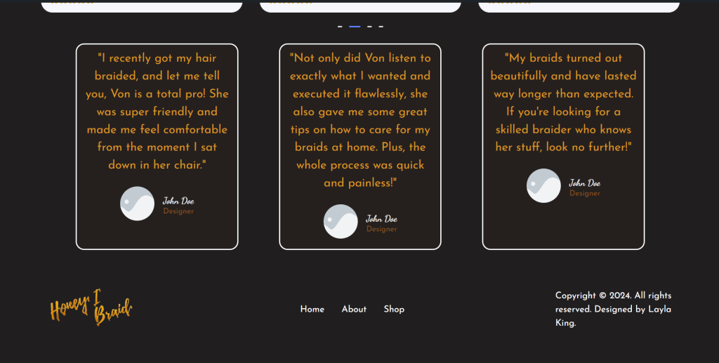
This is a site I’ve been working on for a cosmetology business called Honey I Braid. The logo this client gave me is mostly made up of darker colors, (Brown and black) with a pop of gold. This pop of gold, being honey, takes away any negative feelings someone may get from brown. By combining these colors, it takes the focus away from brown, but the combination also makes brown seem “brighter” and more positive. It’s a visually appealing logo!
But logos are different from full websites. I had to find a way to incorporate the color scheme throughout an entire site. Fortunately, I found a resource called Realtime Colors that allows me to visualize a way to combine colors on a website. After playing around with that resource, I found a way to effectively combine these colors. I made black the background color, which isn’t a problem since dark mode is a popular and growing trend. In fact, in 2020 over 88% of people said they preferred using dark mode via Gitnux. More recently, from forms.app, about 82% of smartphone users prefer dark mode since its known to reduce eye strain and improve readability. To contrast that, I made white the text color. But to make sure it wasn’t too contrasting, I avoided using the exact #000000 black as the background. Lastly, I used the 60/30/10 method to determine which colors to use and how much. I decided to use brown as the primary (60%), gold as the secondary (30%), and a lighter shade of brown as an accent color (10%).
Honey I Braid
– Layla King
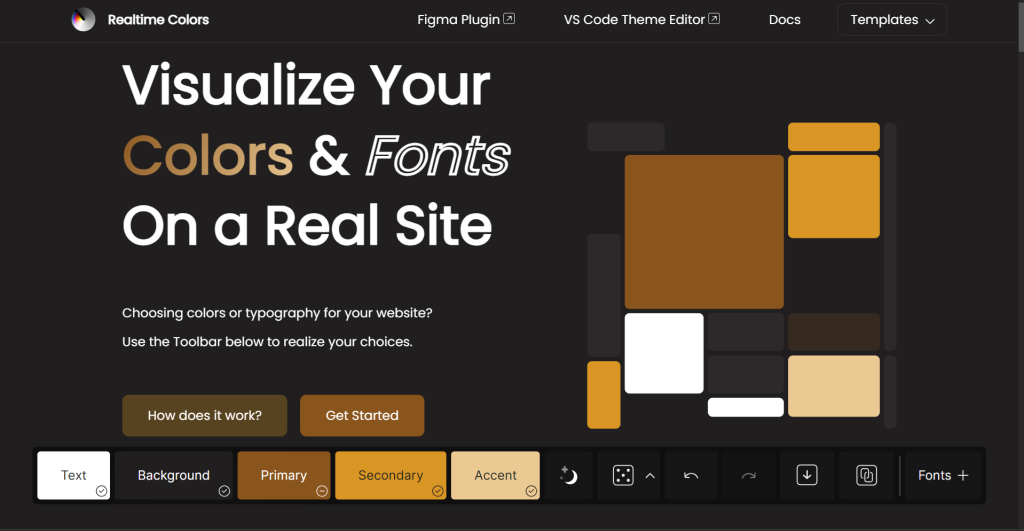
Example Site
– Realtime Colors
Salon Sona (2)
Salon Sona uses browns that don’t seem like a typical brown. They seem to have a combination of pink and purple mixed with brown. I looked up two of the colors and they’re about a (#6a3332), which has a percentage of magenta and yellow in CMYK mode and uses mostly red in RGB. The other color, a (#edc9bd) which seems pink but is a tint of brown, also has mostly red in RGB, but also has elevated levels of green and blue. They do a fantastic job of using these colors to separate the content.
Sahel (2)
Sahel uses brown to make their products and imagery stand out. Its an interactive and animation filled site. Since its a coffee business, using brown to represent nature was a good move.
Lincor (3)
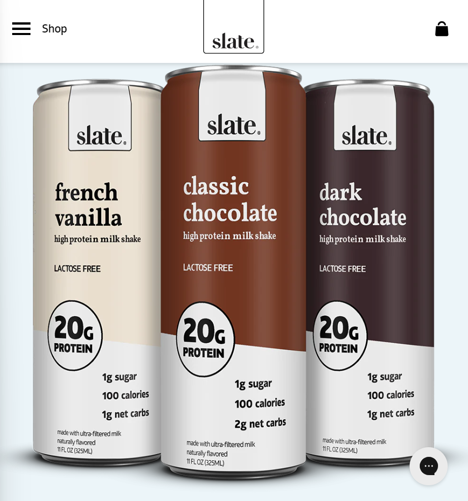
Similar to Sahel, Lincor uses brown to make their products and imagery stand out. Except at Lincor, the brown is used as a background color in some of the imagery, rather than the entire product.
Rescue Sanctuary (4)
Although its only a picture of the design on 99designs by win2010, the way this designer used brown is spaced out well. In addition, the different shades used allowed this designer to use a 60/30/10 method to balance all of the colors. (Brown, lighter brown, white).
8 More Brown Website Examples

Accueil (5)
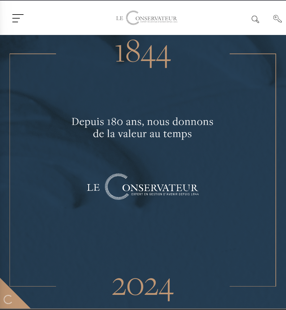
Le Conservateur (6)
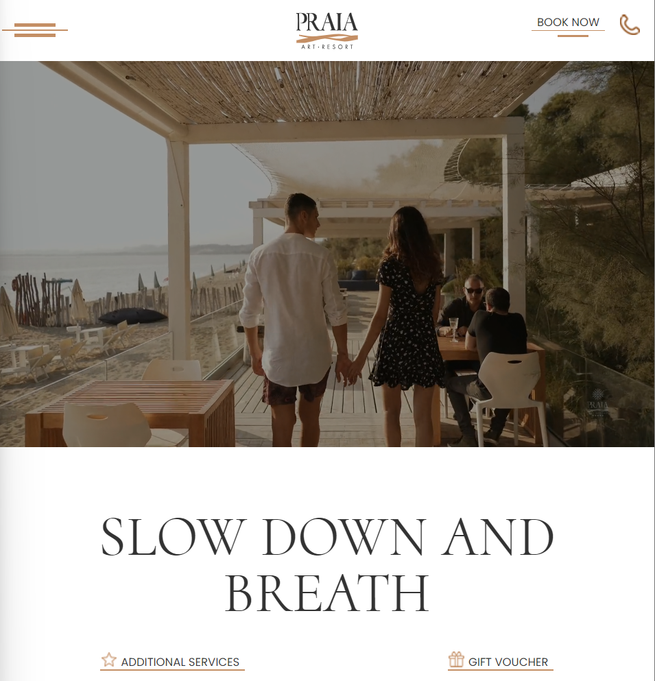
Praia Art Resort (7)
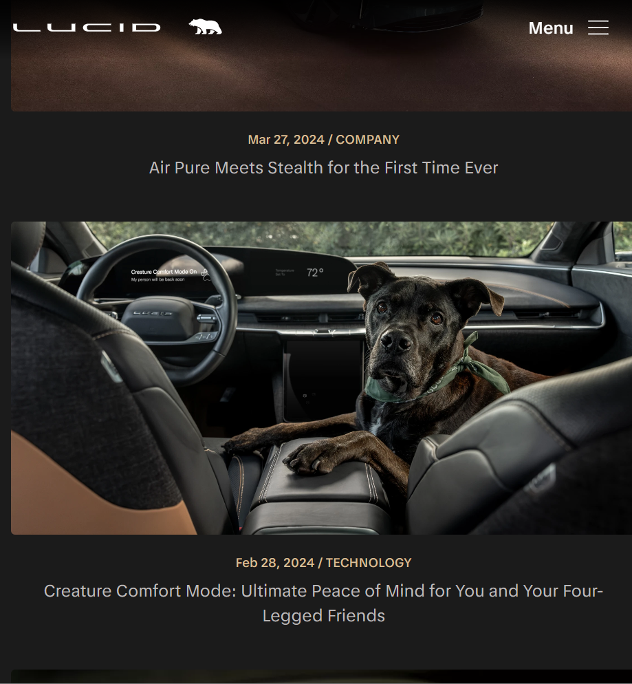
Lucid Motors (8)
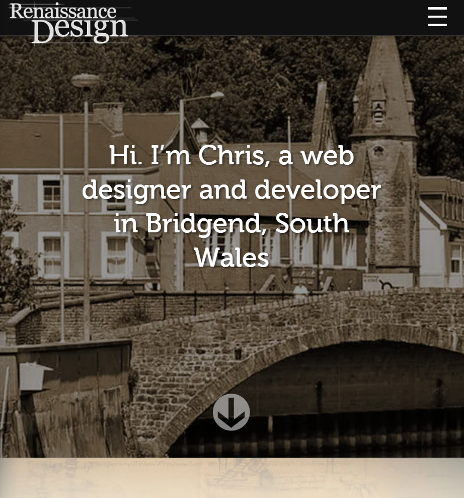
Renaissance Design (11)
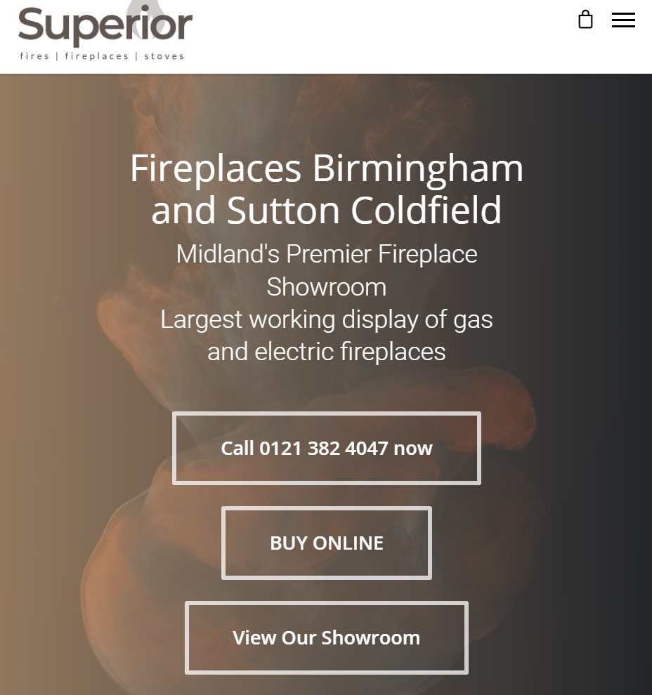
Superior (12)
